There are a million opportunities to place ads on the web these days. You’ve got your classic PPC AdWords ads, Facebook Ads, Display Ads, and Native is predicted to make a big impact in 2017. If you’re going to invest in paid advertising on the web, please don’t make the mistake of creating a poor and confusing user experience for the small percentage of people who actually click on your ads.
This happened to me twice recently and I was really surprised. It wasn’t like some small one-man roofer who doesn’t claim to know anything about internet marketing made the mistake either. These were two big-time advertisers whom I have a great deal of respect for. In fact, I’ve used Tempur-Pedic’s ads in my “how to do it right” training several times. And MLB Shop, well, they normally do a great job of advertising on the web. My credit card statement is proof of that.
So, I’m going to share these two examples with you to show you how even the smartest of web advertisers can overlook this element of a campaign, and I’m going to encourage you to make it a priority in your advertising.
LANDING PAGE FOR PAY-PER-CLICK AD
I’m a Kansas City Royal’s fan. My boys won The World Series last year, and I’m a fan of the roster. Unfortunately, they lost Ben Zobrist to the Cubs and because he was my daughter Zoey’s favorite player (both play outfield, both are #18 and both have “Zo” in their names) she suddenly became a Cub’s fan. What can I say? Kids, right?
Cut to yesterday when I found out that my favorite KC Royal, Wade Davis is going to the Cubs. Dammit! While I’m still a die-hard Royal’s fan, I may have to get a Cub’s hat. I know. Blasphemy. But really, who didn’t love the Cubs this year? (Oh yeah, Cleveland. Sorry, guys.)
Aaaaaaaanyway. I did a search on Google for a Cub’s hat and saw this:
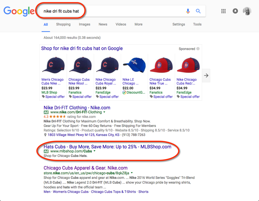
I liked the MLB Shop ad and clicked on it. It took me to this landing page:
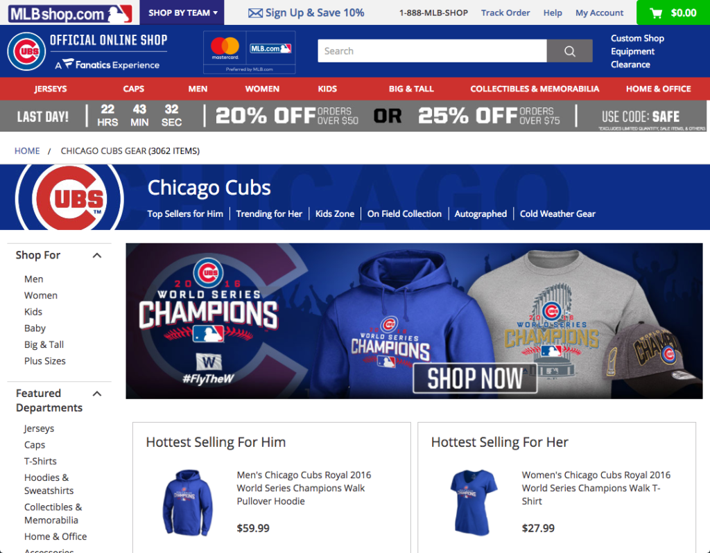
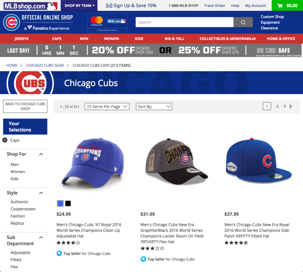
Do you see the problem? I was shocked. I immediately hit my back button and started looking elsewhere. Not only did MLB lose a lead, they lost a lead they had paid for (PPC costs $!). What a shame. All they had to do was direct me to this page instead, and we would have had a different experience.
Now you may be thinking, “Come on, David. All you had to do was click around a bit and you would have found the hats.” You’re right. I could have. But looking for a hat, and then finding t-shirts and jerseys when it would have been SO EASY to just take me to the hats, well it put me off. And what if I’m in a hurry, or I’m my Baby Boomer mother? No offense to Boomers, but I can almost hear my mother shopping for a hat for her granddaughter and saying, “Well, there are no hats on this page? Guess I’ll go back to Google and try another.” Right? Am I right? I think you know I’m right.
Maybe not. Maybe users are clicking around until they find what they want. Maybe I’m making a big deal over nothing and MLB would say, “We do this on purpose so we can show off our other inventory and upsell the person shopping for a hat.” I can’t say. All I know is that directing the ad to match the landing page would do to things for sure.
ONE: It would improve the user experience. What can I say? I searched for a hat. I clicked an ad about a hat. I expected to find a page about… hats.
TWO: Having that trifecta of the keyword, the ad and the landing page all be about hats would have improved the quality score of the ad, and potentially decreased the cost of the click. And no one can argue with the value of paying less for advertising.
Disagree with me? Let me know in the comments. I can take it.
LANDING PAGE FOR FACEBOOK AD
Here’s one more example for you. As I was surfing Facebook yesterday, I saw this paid ad in my news feed:
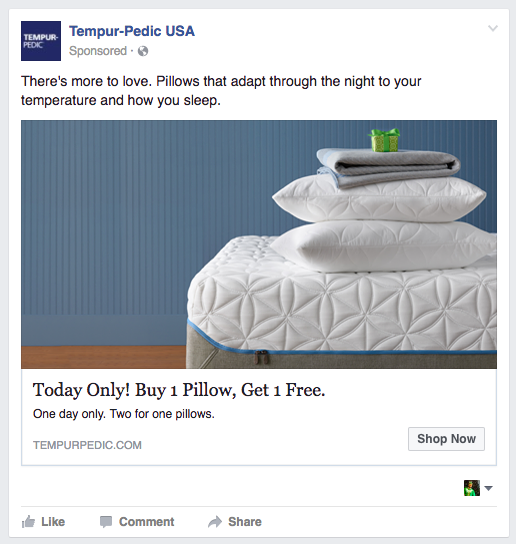
Great ad. Seriously great ad, especially for me because I am a Tempur-Pedic bed owner and my pillows are terrible. I could use a fancy pillow right about now. (I’m a delicate flower.) So, I clicked and was taken to this page:
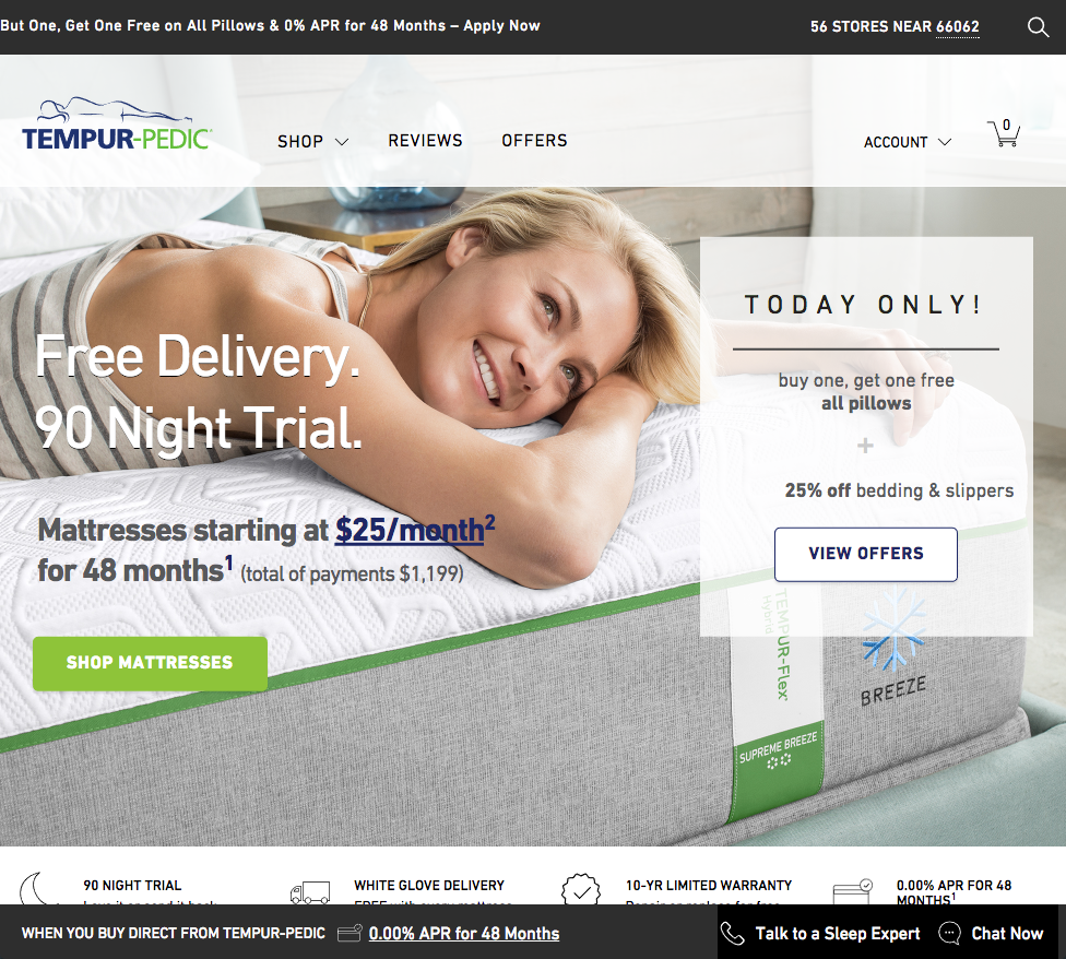
Where are the pillows? Okay, this one isn’t AS bad. There’s a call out banner about the pillows, that encourages me to buy them. But why the extra click? What’s the point? Why not just take me directly to the page that sells pillows?
It would have been so easy to direct the click here, and it would have been a better user experience. I know. You think I’m being picky. And maybe I am. But isn’t it the little things that get overlooked by some that make the biggest difference?
Directing an ad to a landing page where the copy matches the ad is an easy thing to do. And it makes for an awesome user experience.
LANDING PAGE FOR RETARGETING AD
I’ll leave you on a much less critical note. In fact, I’m going to praise Tempur-Pedic now. When I didn’t buy the pillows right away, they decided it made sense to retarget me while I was surfing the web. I saw this ad later in the day:
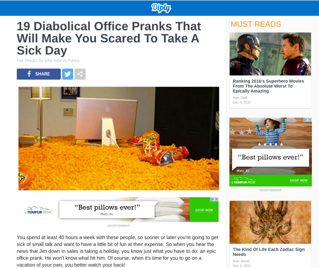
Yes, I am somewhat of a prankster and have been known to throw down some serious office pranks. But that’s not the point. These ads caught my attention and I really do want to buy those pillows. So when I clicked the ad, I was ecstatic to see that it took me directly to this page:
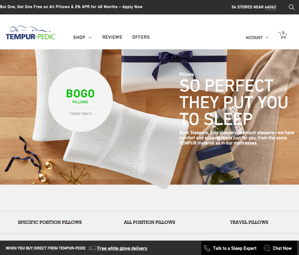
Applause. Applause. That’s a good user experience. That’s how it’s done. When an ad compels a user to take action, it should direct them to a page that aligns with the ad copy. I’m happy to see Tempur-Pedic knock this one out of the park.
Have I bought the pillow? Not yet. It’s nearly Christmas and I can’t really justify buying myself a pillow. But if anyone is wondering what to get me…
Thanks for reading.
David McBee