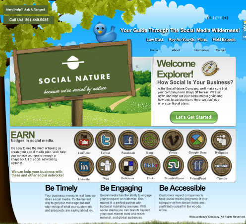
I was recently talking with a client who really likes his website. He feels it’s creative and beautiful and a great experience for his potential customers. He’s right. It is a cool site – colorful, vivid, interesting. There’s not a square button in site… on the site.
One problem – the site doesn’t rank for his keywords. Even in the small neck of the woods where he is, without a ton of local competition, he’s struggling to rank. And here’s the worst part. When he wants to make significant changes to the site, he has to pay his web designer an hourly fee to make those changes. He’s basically “handcuffed” to the designer.
So I suggested he rebuild the site in WordPress. My logic being that, once built, he would be able to make as many updates and add as many new pages as he needed any time now or in the future. Certainly WordPress isn’t the only CMS that could be used, but it’s certainly popular enough and there’s a lot of support out there in the way of plugins and tutorials.
[Note: WordPress sites do not have to be boring. There are thousands of themes available and some very big sites use WordPress to power their sites including SONY, VW and even Katy Perry.]
I struggled to help the customer understand why he had to choose between beauty and creativity and something clean, simple and easy for Google to crawl and read. And then I thought about Google’s own home page. It’s basically one image and one search field. Simple. Clean. Boring. Even after you do your search, what do you get? Something beautiful and interesting (visually)? Nope. Just text. Plain, simple, boring text. So if this is what Google serves up to the world a million times an hour, doesn’t it stand to reason that this is what they expect from other websites? Even YouTube, a site all about creativity, is basically just a bunch of thumbnails and video descriptions. Gmail? Except for a few skins you can apply, it’s all plain text and square fields.
I remember a few years ago, before SEO was such a big deal, I built one of my first sites using FLASH, a programming language that Google doesn’t even recognize (mostly). I had cool, fun elements on that site that I wouldn’t dream of using today – all because I want my site to be “Google friendly” and to rank well.
 Take a look at this site. They offer social media help. They are located in Salt Lake City. I love their website. It’s fun, has colorful motion and even cool music that fits their “merit badge/nature” theme. Overall very very cool!
But I searched for their business in Salt Lake City using a number of different keywords and never could get this site to appear in the top 100 search results. I did finally find them ranking in the third position on Google when I did an exact business name + city search, but it was a different site of theirs, not near as cool. As a social media company, I’m guessing that SEARCH isn’t their number one customer driver. I get that. But I also think it’s sad that Google doesn’t elevate sites like this in their search results. This is a good site and they appear to be at least more authoritative about social media in Salt Lake City than several of the other results that Google put in front of me. Why? Because the whole site is built in FLASH and Google probably has no clue what it’s about.
That’s just one example I found by searching for “great FLASH sites”. BTW, the site didn’t come up in that search either. It was on a list of great FLASH sites published on a site NOT built in FLASH.
What if we could measure Google’s influence on web design across the whole web? What if there were no Google or there was another search engine that valued interesting design and creativity in a website? What would the web look like today? HAS Google actually diminished our creativity and made the web boring? What do you think?
Thanks for reading.
David McBee


I have seen many sites using jQuery to substitute Flash. Granted, it is not the same. Just last year every new webpages had the parallax effect and to some degree it also started to get boring.
WordPress has also contributed to making the web a bit less fun. Almost every webpage it’s the same even though the graphics change.
Blaming it on google, though, seems to me a little unfair. I mean, almost nobody uses flash anymore but it’s not only because of google. It has a lot to do with loading times, user interactions, devices supported, etc.
SEO is just one of the aspects where flash falls short but there are many other elements.
Besides, for me having html, php & javascript to create a webpage seems already a bit too much.
You make several excellent points. Thank you for sharing and thanks for challenging my article. 🙂
Question to think about:
Does Google being plain, simple, and FLASHLESS make us more boring,
OR could it be a catalyst to challenge us?
to be MORE creative, rich and genuine in our interactions?
I should add that Apple hasn’t helped much either. They refuse to put software on their iDevices that allows FLASH. I understand why. FLASH requires a lot of resources, but still. How many businesses have removed FLASH elements from their site because someone told them they couldn’t view it on their iPhone?